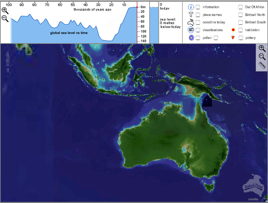
Figure 1. SahulTime as it appears when first loaded, set to 'today'
University of Sydney. Email: johnson@acl.arts.usyd.edu.au
Cite this as: Johnson, I. 2008 Review of SahulTime (website) Internet Archaeology 24. https://doi.org/10.11141/ia.24.7
SahulTime is a browser-based Flash application. http://www.sahultime.net
SahulTime is an interactive map of the Australian continent through time, linked to a timeline of sea level change over the last 140,000 years. Navigation within the timeline modifies the coastline of the region, while additional features on the map - such as labelling of geographic areas and symbols for archaeological sites - switch on and off at appropriate times. Symbols on the map lead to pop-up visualisations which are also linked to the timeline.
The introduction to SahulTime describes it as a collaborative research project between Matthew Coller, lecturer in Multimedia, and the Monash Faculty of Arts (Centre for GIS and Centre for Indigenous Archaeology). The research in question is aimed primarily at ways of using multimedia to communicate information to students, and SahulTime should be assessed in this context rather than as a finished educational product, although it is perfectly usable as it stands.
Figure 1. SahulTime as it appears when first loaded, set to 'today'
The primary mode of navigation is through the timeline, although the map has normal zooming and panning functions. Clicking anywhere on the timeline jumps the current state of the map to that point in time, indicated by a vertical red line and a red dot at the corresponding sea level (Fig 2). To the right of the timeline the sea level is also shown by a vertical indicator which 'fills' and 'empties', as well as by a numeric value for date and sea level relative to today. The bar on the timeline can also be dragged to provide a continuous animation of the map, which can be rather jumpy on slower computers.
The timeline component can be zoomed in and out repeatedly using the plus and minus magnifiying glass icons on the left. Labeling intervals switch very smoothly to maintain sensible units and numbers of divisions (back to hundreds of millions of years). The timeline is pinned to zero at the right, which maintains context and effectively restricts the ability to zoom in to older time periods where the data would be inadequate. Prior to 140,000 no sea level curve is shown (from 140,000 onwards it is based on Lambeck and Chappell 2001) but there are sea level values in the system prior to this date (although no source is given - some explanation and/or graphical strategy for indicating uncertainty in this period is needed).
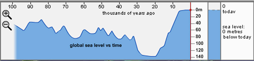
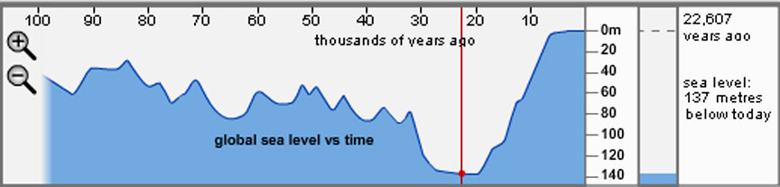
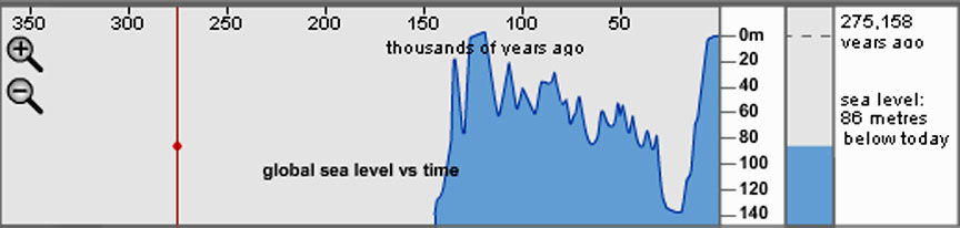
Figure 2. Sea level display and selection of time through the timeline component. No sea level curve is shown beyond 140,000 BP but sea level data exists (source and resolution unknown).
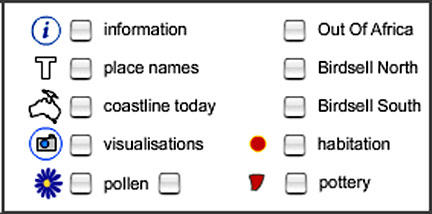
Figure 3. The map legend at top right controls visibility of a number of map layers.
The information layer switches on links to information about the data sources used in the map and sea level curve. The content of the place names layer changes with time (Fig 4) and the handy coastline today layer provides a context for the coastline changes.
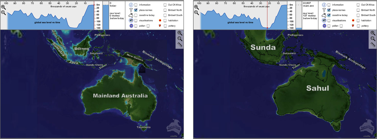
Figure 4. Labeling of the land masses changes with time selected from the timeline.
The visualisation and pollen layer symbols open windows containing simple visualizations which are time sensitive. For example, the 'Sydney through the Holocene' pop-up shows the changing extent of Holocene flooding on a 3D visualization of the harbour as one moves into the Holocene. The Torres Strait pop-up shows a modern aerial photo at periods of high sea level, and two alternative computer visualizations which fade in and out when the sea level is lower. The pollen links show a landscape visualization with changing plant communities. From past discussions with the author I believe this is an automated feature driven from actual values rather than hand-coded animation.
Three migration route overlays - Out of Africa, Birdsell North and Birdsell South are trajectories which animate once when switched on but are independent of the time setting. Points in the pollen, habitation and pottery layers are displayed over specific time ranges and fade in and out at the start and end of these ranges (although it is not clear what algorithm is used and whether this represents dating uncertainty or is simply a visual metaphor for approximate dating).
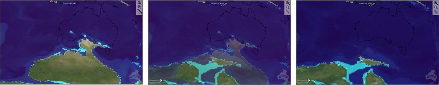
Figure 5. Use of fading between coastlines for 90, 100 and 110M years ago. The 100 M year map is a composite of the flanking maps.
A similar technique is used to handle coastlines, resulting in some hard-to-interpret double images in the more distant past (Fig 5). When zoomed out to world scale, SahulTime also shows the extent of ice sheets back to around 10M years ago (Fig. 6). However this is not the application's core focus and is clearly a proof-of-concept (the data is both generalised and arbitrary - for instance the map at 8M is identical with the modern outline). The coastline today layer provides a useful reference for the core area but does not unfortunately extend to the rest of the world.
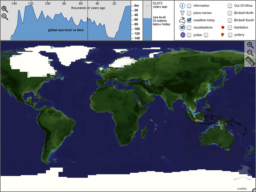
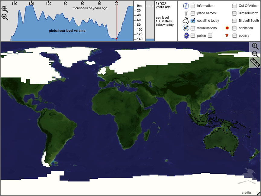
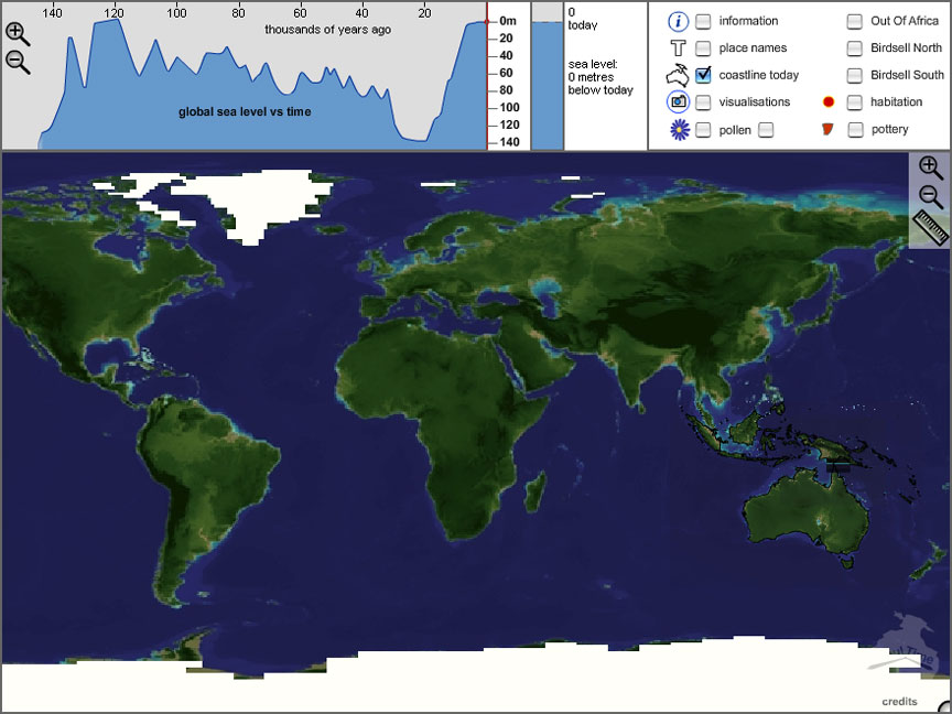
Figure 6. Ice sheets at 50,000BP, 20,000BP and today.
SahulTime describes itself as "extending each of Google Earth's paradigms through a further dimension in time". While this is an attempt to situate the application relative to a now-familiar paradigm, it seems a little misguided, as one might pick any number of other mapping applications with which it has more in common. SahulTime's most original characteristic is its use of multiple linked visualisations, a methodology it shares with highly interactive thematic map applications such as GapMinder or Instant Atlas or the work on geographic data visualisation at Pennsylvania State University). It is perhaps a bit picky to point out that SahulTime has less in common with Google Earth than Google Map - it is two dimensional, has a limited fixed map legend rather than a hierarchical layer control, and it is lightweight and browser-based.
SahulTime is clearly an application which lends itself extremely well to the web medium. It is well laid out, attractive and intuitive in use. At 500KB and written in Flash, it is a light download and should run on practically any hardware and browser. It has no help function, but scarcely needs one as the author has paid careful attention to usability (for example, when first loaded, an animated arrow moves repeatedly across the timeline saying 'Click and drag' until you start to interact with it).
SahulTime does an excellent job of presenting the changing outline of the Sunda/Sahul region through the last 140,000 years and of tying this to sea level change. Its intuitive interface would allow it to be used in the classroom or form the basis for students to explore specific questions designed to enhance their understanding of the region.
The rest of SahulTime is, however, at the level of proof-of-concept. The smallish number of links to further information - sites, visualizations, continental drift and ice sheets - point to scanty and arbitrary information. The pilot nature of this part of the application begs the question of how it would cope with real data involving the dozens or hundreds of spatially and temporally located sites, explanations, visualizations and web links which might be needed to adequately present, for example, Aboriginal migration to Australia (which is the target hinted at by the current selection of information). Specifically:
More generally, although SahulTime does an excellent job of presenting the sea-level/coastline relationship, it has no narrative structure which might be used to discuss the consequences of coastline (or other) changes, or to present alternative theories. The simple animation of alternative migration routes hints at some methods of presenting a narrative through Flash objects which might be triggered from a narrative layer, but at this stage it is only a hint.
These limitations should not be taken as criticisms of the application as it stands. It is an original attempt to present a spatio-temporal phenomenon - sea level and coastline change - as an interactive application rather than as a pre-generated animation. As such, it invites exploration of these changes, which is more engaging, more informative and more likely to promote understanding and retention than passive consumption of static maps or map animations. With some serious work on developing appropriate resources linked to the map - particularly some detailed explanations of the sites and issues linked, for example, to the potential migration routes - SahulTime would be a valuable teaching resource for this particular issue.
The value of the application goes further however, as the framework could be used to create a series of similar teaching resources for specific issues, such as the development and spread of particular technologies, environmental changes, the evolution and spread of human types or changes in settlement patterns or pottery styles. The idea of synchronizing the content of pop-up windows with the timeline on the main map to visualize the changes in particular attributes (sensu lato), is quite original and effectively squeezes an extra dimension out of the map visualisation.
SahulTime does not claim to be a finished product, even though the current application provides a perfectly usable resource for illustrating the effects of sea level change. Instead, it should be seen as an exploration of original ways of presenting spatially and temporally changing phenomena in a concise and engaging format. For the moment SahulTime is a manually-constructed application for one specific phenomenon, developed as an educational visualisation research platform. However it has already developed display concepts and automation of links between views which could, with significant further work, be used to build a generic application drawing data from a range of back-end databases. Alternatively, the current format could be re-used with relatively little work to build small, focused teaching resources for specific issues.
November 2008: It has been brought to the reviewer's attention that SahulTime does in fact load additional information on the fly when one zooms in on an area where there is more detailed map data available (eg. Tasmania). The non-spatial information connected to points on the map is also loaded on request. SahulTime can scale some vector information independently, such as placename labelling. The author advises that SahulTime uses an equirectangular projection and operates internally with geographic coordinates.
Internet Archaeology is an open access journal based in the Department of Archaeology, University of York. Except where otherwise noted, content from this work may be used under the terms of the Creative Commons Attribution 3.0 (CC BY) Unported licence, which permits unrestricted use, distribution, and reproduction in any medium, provided that attribution to the author(s), the title of the work, the Internet Archaeology journal and the relevant URL/DOI are given.
Terms and Conditions | Legal Statements | Privacy Policy | Cookies Policy | Citing Internet Archaeology
Internet Archaeology content is preserved for the long term with the Archaeology Data Service. Help sustain and support open access publication by donating to our Open Access Archaeology Fund.