Cite this as: Unger, J., Dzurilla, D., Košťál, M. and Košta, J. 2026 'Breathing Life into Archaeological Archives: Crafting Compelling Narratives with 3D Digital Storytelling', Internet Archaeology 72. https://doi.org/10.11141/ia.72.13
We must acknowledge that archaeological archives and repositories contain many fascinating stories about our past, well known within academia yet largely unknown to the public. The need for clear presentation and communication of archaeological heritage to general audiences has become increasingly critical across Europe, particularly as an effective means of protecting archaeological monuments (Olivier 2016).
In the late 20th century, highly professionalised archaeology often distanced itself from the public, who were treated mainly as passive recipients of research results (Willems 2014). Digital technologies and new forms of computer-mediated communication have since transformed this situation, offering unprecedented opportunities for cultural heritage presentation.
Three-dimensional (3D) computer reconstructions now play a key role in making the past accessible. Their potential in virtual space continues to grow, creating an urgent need for systematic frameworks that guide their use in heritage interpretation. While not seeking technical originality in the field of digital graphics, this article contributes significantly to the practical understanding of 3D visualisation, especially for heritage managers, curators and archaeologists, by outlining how virtual reconstructions can be effectively designed and implemented for the communication of archaeological heritage.
The creation of such visualisations is inherently multi-perspective, involving technological, aesthetic, cultural and epistemological dimensions. They function as complex memory structures shaped by both data and interpretation. Following the principles of the London Charter, reconstructions should adopt a flexible approach, making the degree of credibility in each element transparent rather than claiming absolute certainty.
A major challenge remains how to visualise uncertainty — temporal or spatial gaps, missing data and interpretive bias — in ways that are comprehensible to diverse audiences (MacEachren et al. 2012). The present article therefore proposes a taxonomy and framework for producing 3D reconstruction outputs from archaeological contexts, developed through collaboration between archaeologists, architects, modellers and museum curators. This article aims to define a practical and conceptual framework for 3D archaeological storytelling that balances scientific transparency and public communication.
Images are among the most powerful tools of human communication, capable of conveying information far more quickly and effectively than text alone. Visualisation reduces interpretation time by providing immediate access to an overview, encouraging active engagement and faster comprehension (Tondl 1996). For archaeology, where sources are often fragmentary and complex, this ability is particularly valuable.
Beyond illustration, visualisation functions as an interpretive act that transforms information into forms that are comprehensible to both experts and the wider public. Recent advances in digital technology extend archaeological visualisation from traditional drawings to interactive 3D models and immersive environments. Such reconstructions not only illustrate shapes, colours and spatial relationships but also allow users to explore perspectives and simulate processes otherwise hidden in static documentation.
In the realm of information technology, visualisation is a transformative method of converting symbols into geometric forms that enable further simulations and calculations. It unveils the invisible, offering unexpected insights into scientific processes (McCormick et al. 1987). When dealing with objects that are too complex, elusive or purely conceptual, visual models facilitate understanding of their construction, organisation or transformation. Modelling thus creates analogies to phenomena lacking a physical form, especially multidimensional or time-varying entities (Nevěřilová 2004).
A critical question remains whether archaeology possesses a coherent visual language. While imagery has always played a central role, its conventions are not standardised, resulting in differing interpretations among professionals and the public (Kostelnick 1993). Strengthening these conventions would make reconstructions more transparent and legible, particularly as they are increasingly shared through digital storytelling. Although the topic of visual language has received some resonance in archaeology, especially in the 1990s (Baigrie 1996; Moser 1992), it has so far remained on the periphery. It has only started garnering some attention in recent studies (Opgenhaffen, 2021, p. 355).
Visualisation, therefore, is more than a supporting tool: it is central to how we construct and communicate knowledge. By transforming complex or hidden data into clear visual narratives, 3D reconstructions make the past tangible and accessible, bridging scholarly research and public understanding.
Archaeological sources provide only fragmented and distorted information about past societies. Once separated from their original context, artefacts become 'dead objects', reduced in meaning and difficult to interpret (Neustupný 2007). Modelling is therefore an essential step in reviving these sources and reconstructing their lost dimensions (Neustupný 1986).
Virtual reconstructions are part of the broader field of Virtual Archaeology, which extends beyond documentation to include speculative approaches — imagining 'what ifs' and 'what might have been' (Beale and Reilly 2017). From its origins in the early 1990s (Reilly 1991), 3D reconstruction has promised new knowledge, yet its adoption into mainstream research has been slow. While reconstructions are widely used for public presentation, their potential as research tools has only recently begun to be realised through virtual experiments (Lacanette et al. 2017; Moskvin et al. 2021).
The central issue in creating reconstructions is data uncertainty. Archaeological evidence is often incomplete, ambiguous or based on analogies. Factors such as geometry, dating, materials or context are all subject to varying degrees of reliability (Brusaporci 2017). Decisions made by researchers inevitably introduce subjectivity, making uncertainty a defining feature of digital visualisation (Schäfer 2018).
In addition, archaeology involves acquiring data from various sources of varying quality. There is, therefore, a need to quantify data, which is often burdened by the subjective preferences and decisions of different entities (individuals). The same applies to written and iconographic sources, where the human factor plays a major role (Schäfer 2018). Due to the very nature of archaeological sources, the lack of data significantly increases the degree of uncertainty, even when analogies replace them (McCurdy 2012; Reilly 1992; Sifniotis et al. 2006).
This challenge has been recognised since the mid-1990s, when Miller and Richards (1995) warned that computer models, while visually persuasive, could be misleading — appearing as definitive versions of the past rather than one possible interpretation. Reilly (1991) similarly cautioned against treating reconstructions as 'pretty pictures'. Scholars such as Barceló (2001) and Sanders (2014) emphasise that models must remain open to multiple interpretations.
Recent studies have focused on making uncertainty more legible to audiences (Demetrescu 2015; Ferdani et al. 2020). The aim is to balance scientific accuracy with accessibility, producing reconstructions that are not only rigorous but also understandable to the wider public. In this article, we propose applying these principles in a systematic taxonomy for 3D outputs, developed through collaboration between archaeologists, architects, modellers and museum curators.
Between 2020 and 2025, a multidisciplinary team created nine short videos for the National Museum in Prague, each presenting a major archaeological site in the Czech Republic. The team included archaeologists, curators, architects, visual communication experts and graphic designers, ensuring a balance of academic credibility and public accessibility.
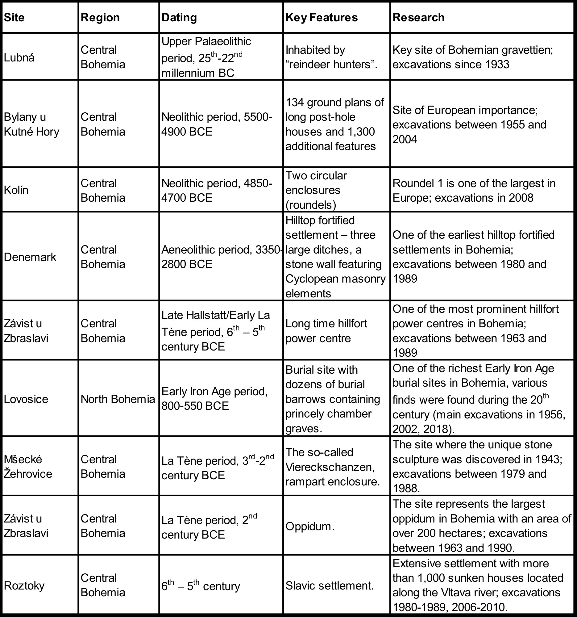
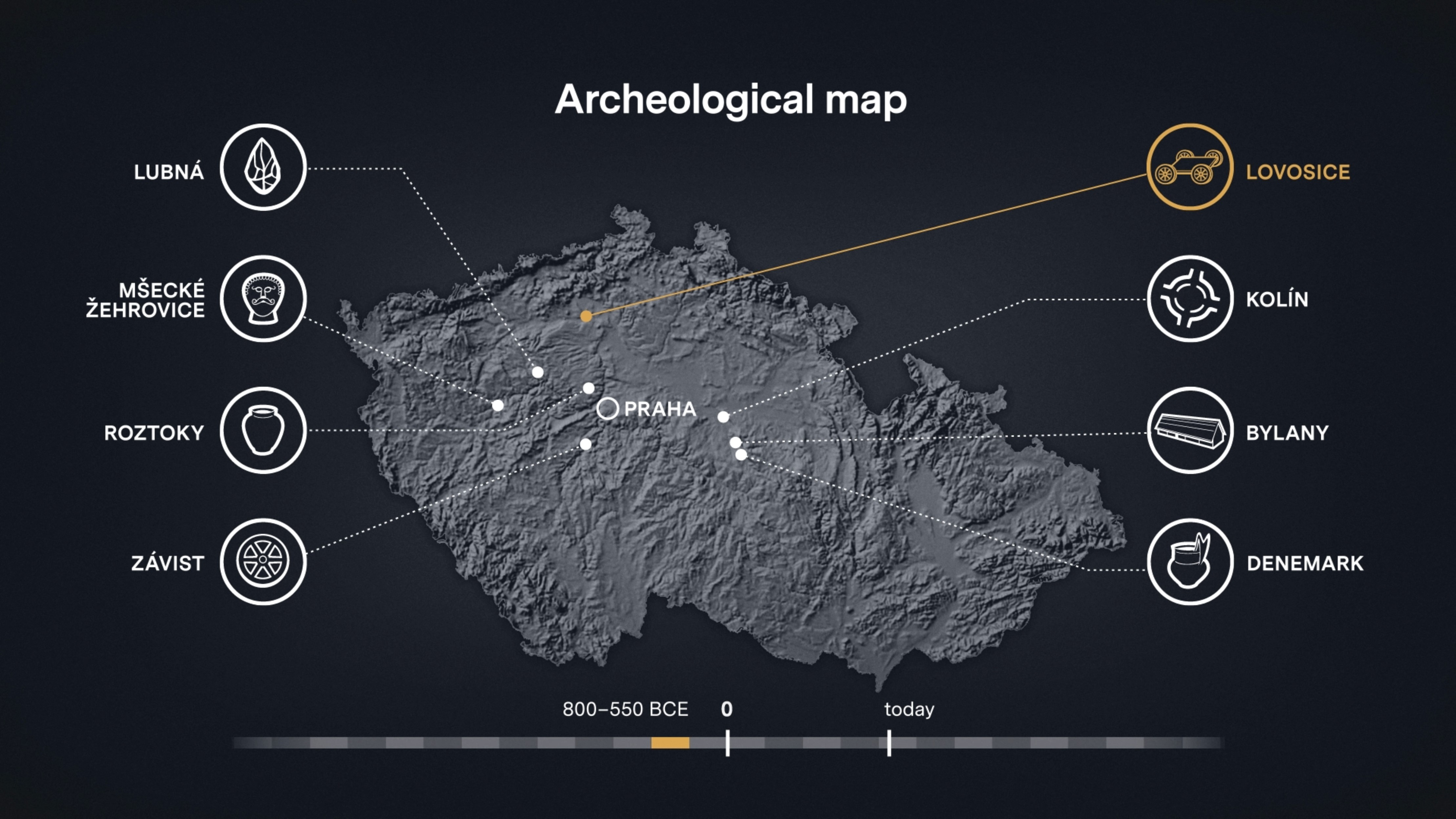
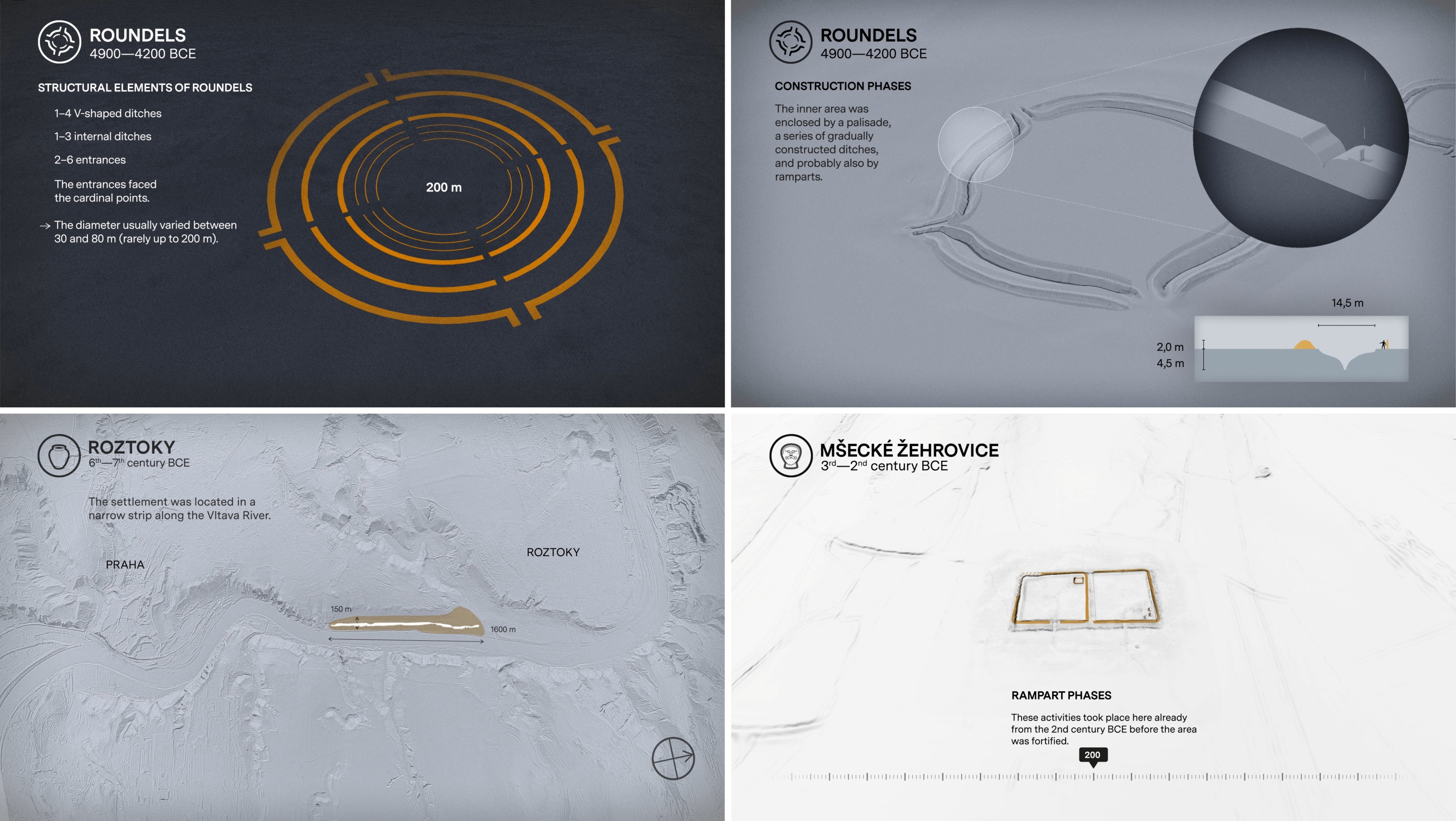
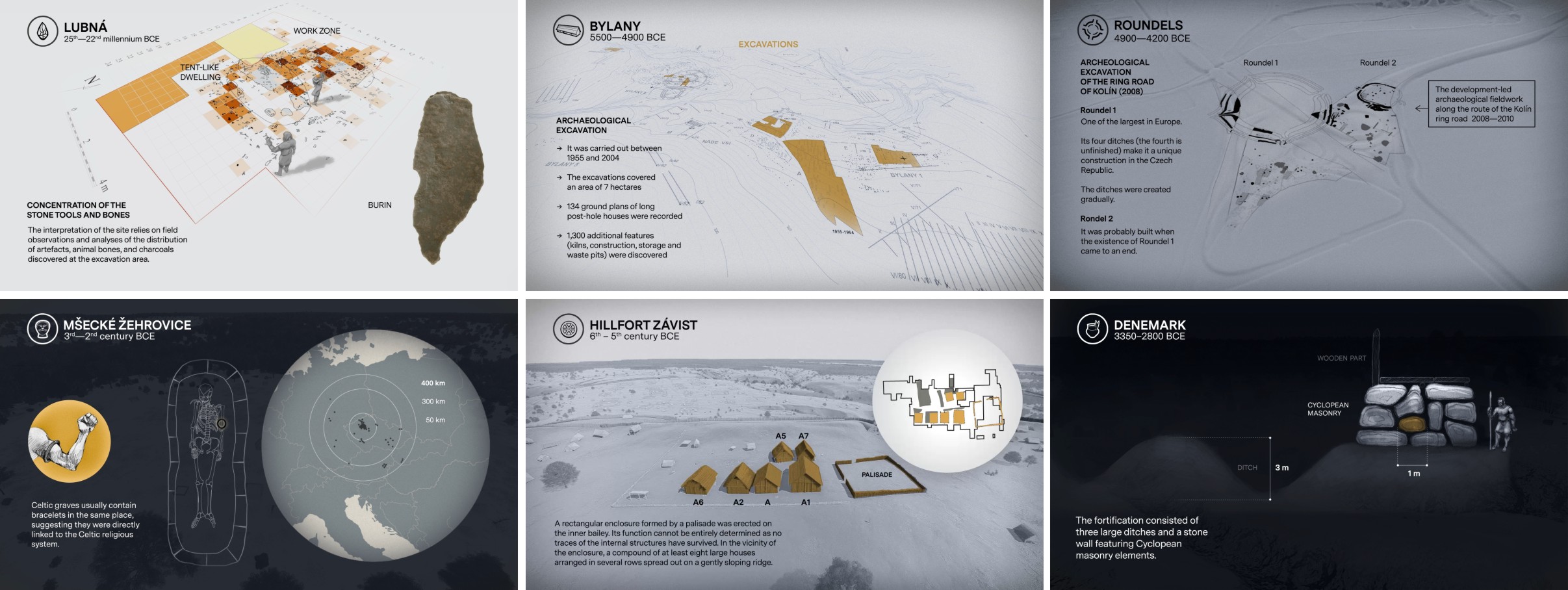
The sites spanned a wide chronological and cultural range — from the Upper Palaeolithic hunters at Lubná, through Neolithic longhouses at Bylany, Aeneolithic fortification at Denemark, Iron Age princely burials in Lovosice, Celtic oppidum at Závist, to Early Slavic settlements in Roztoky. Each site was selected for its scientific importance and ability to illustrate broader cultural processes (see Figure 1).
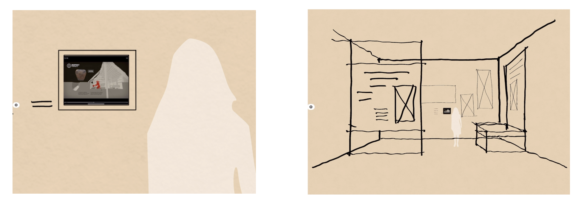
Videos were conceived as concise narratives of 1.5–2.5 minutes, designed for permanent exhibition. Their parameters reflected practical constraints: small projection screens, standing audiences, and the absence of soundtracks (see Figure 2). Communication relied solely on moving images, text and stylised animations. The challenge was to maintain clarity while sustaining visitor interest across multiple sites.
The concept emphasised consistent visual language across all videos, with each site introduced by pictograms and a focus on one emotionally engaging artefact or context. Storytelling principles guided the design: videos needed to be visually appealing, simple to follow, and capable of sparking curiosity about the wider exhibition (see Figure 3).
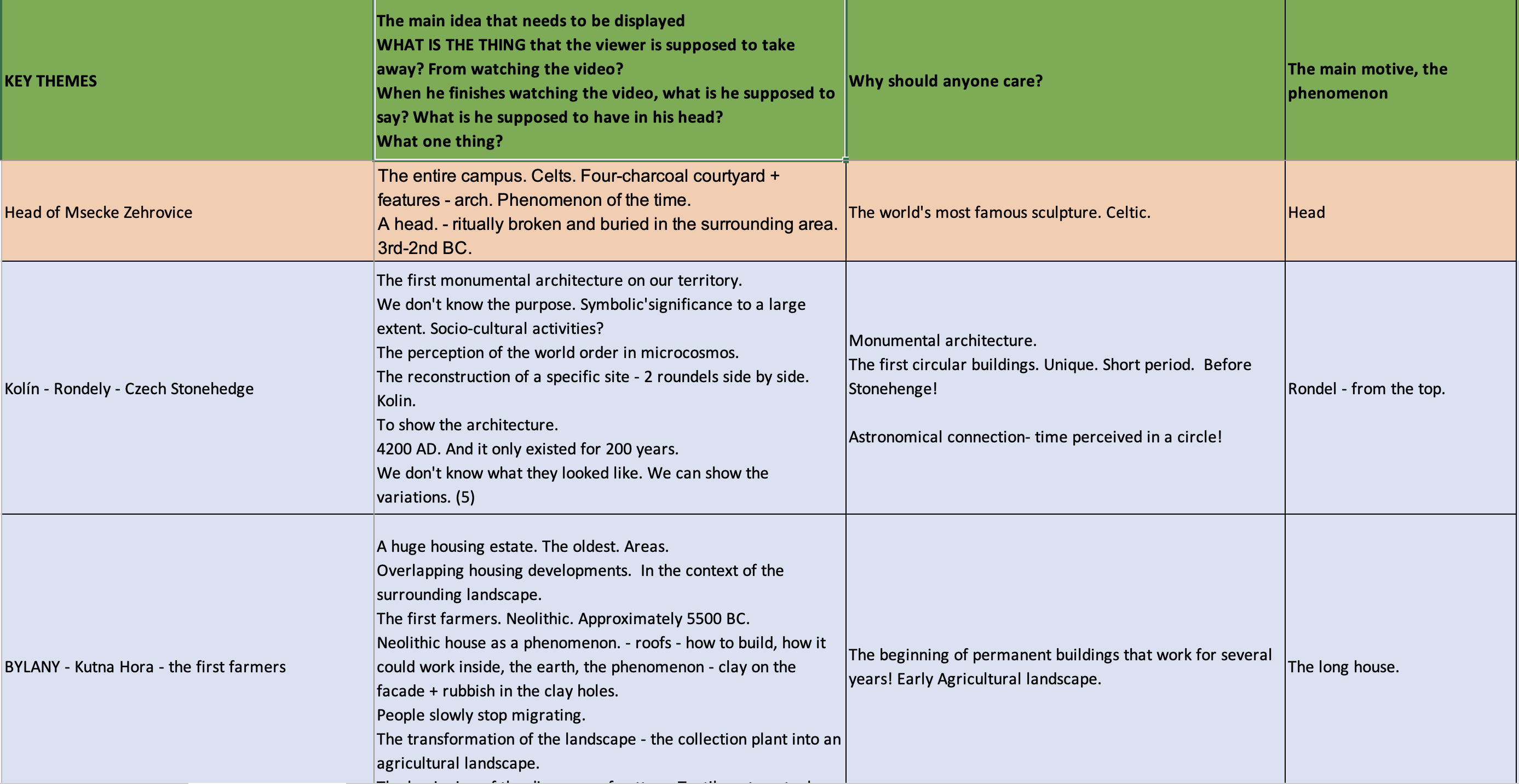
Transforming an archaeological concept (Figure 4) into an effective visual communication tool involves three interrelated stages: defining the core message, conceptualising the idea, and elaborating the visual form (Balzotti 2016; Campbell and Cox 2018).
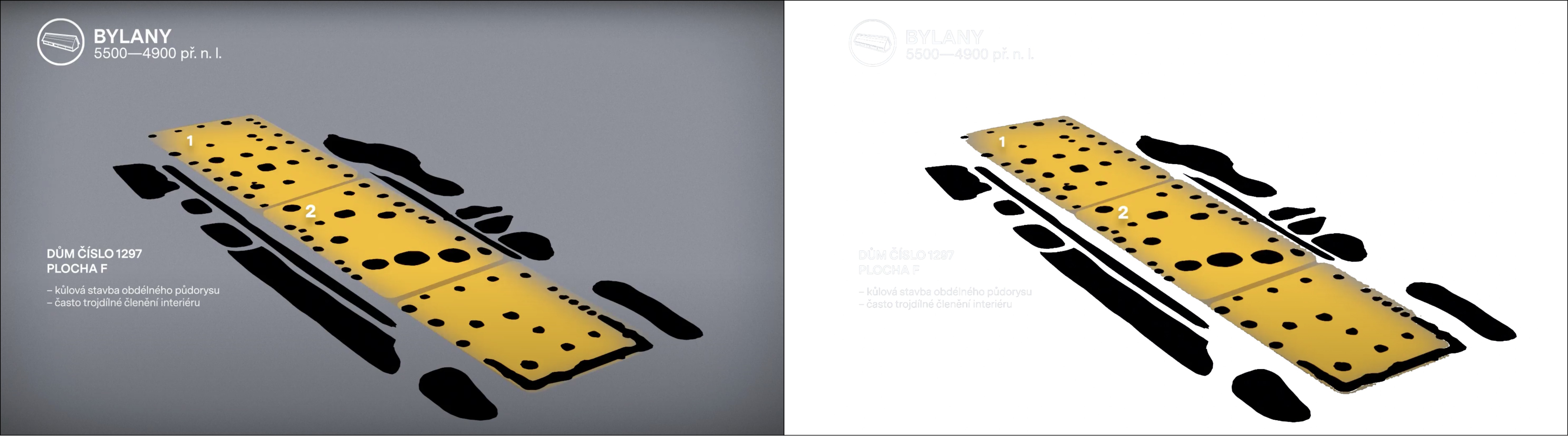
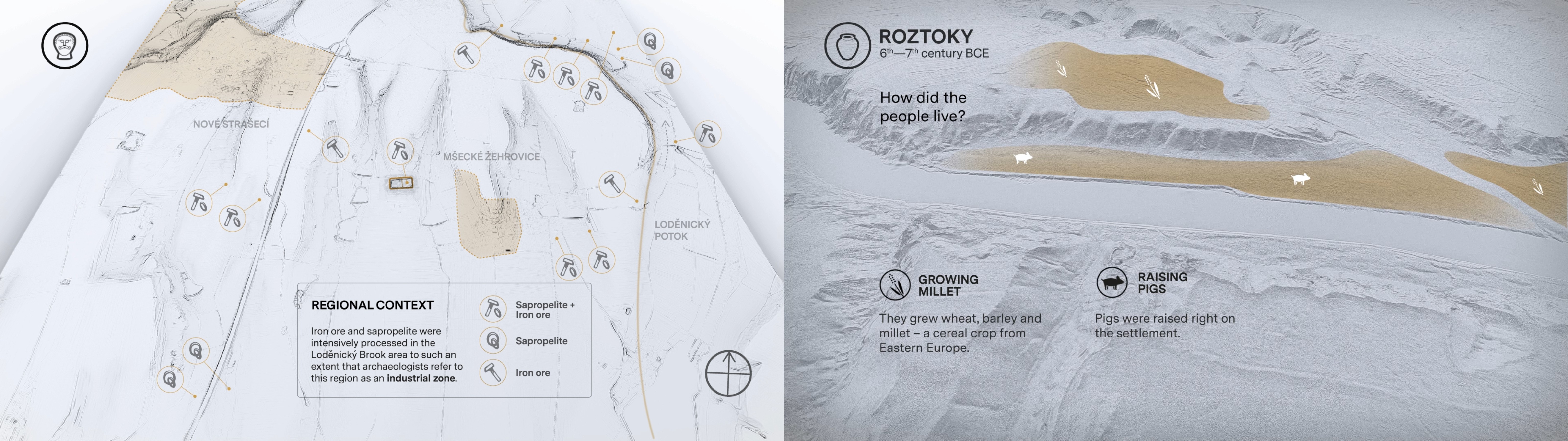
The process begins with a clear definition of the core message — a concise idea that captures attention and enables identification with the subject. To reinforce this, three supporting themes are usually selected, reflecting the phenomenon's location, construction, and content. A distinctive artefact or feature often serves as an emotional anchor, linking abstract interpretation with human perception (Figure 5).
Conceptualisation translates these ideas into visual form through sketches, model previews and storyboards, which define the narrative structure and rhythm. This stage ensures harmony between visual and textual components, with the text clarifying rather than duplicating imagery (Figures 6–8).
The final step, visual articulation, combines 3D reconstructions with other media — graphics, illustrations or photography — to convey the intended message (Figure 9). Stylised 3D reconstructions are particularly effective, as they can highlight essential details, emphasise relationships, and evoke atmosphere beyond the limits of realism.
Although 3D reconstructions may appear less anchored in 'reality' than, for example, fieldwork photographs, they often achieve stronger communicative impact. By conveying atmosphere, emotion and perspective, they present the past in a way that feels more immediate and personal. At the same time, they integrate easily with other visual materials — whether textual or abstract graphic elements — strengthening both clarity and didactic value (Samara 2014, 206–207).
By systematically moving through these three stages, complex archaeological information can be transformed into short, engaging narratives that maintain scientific credibility while remaining accessible to broader audiences. This methodology illustrates how 3D reconstructions function not only as academic outputs but also as effective tools for cultural presentation and public education.
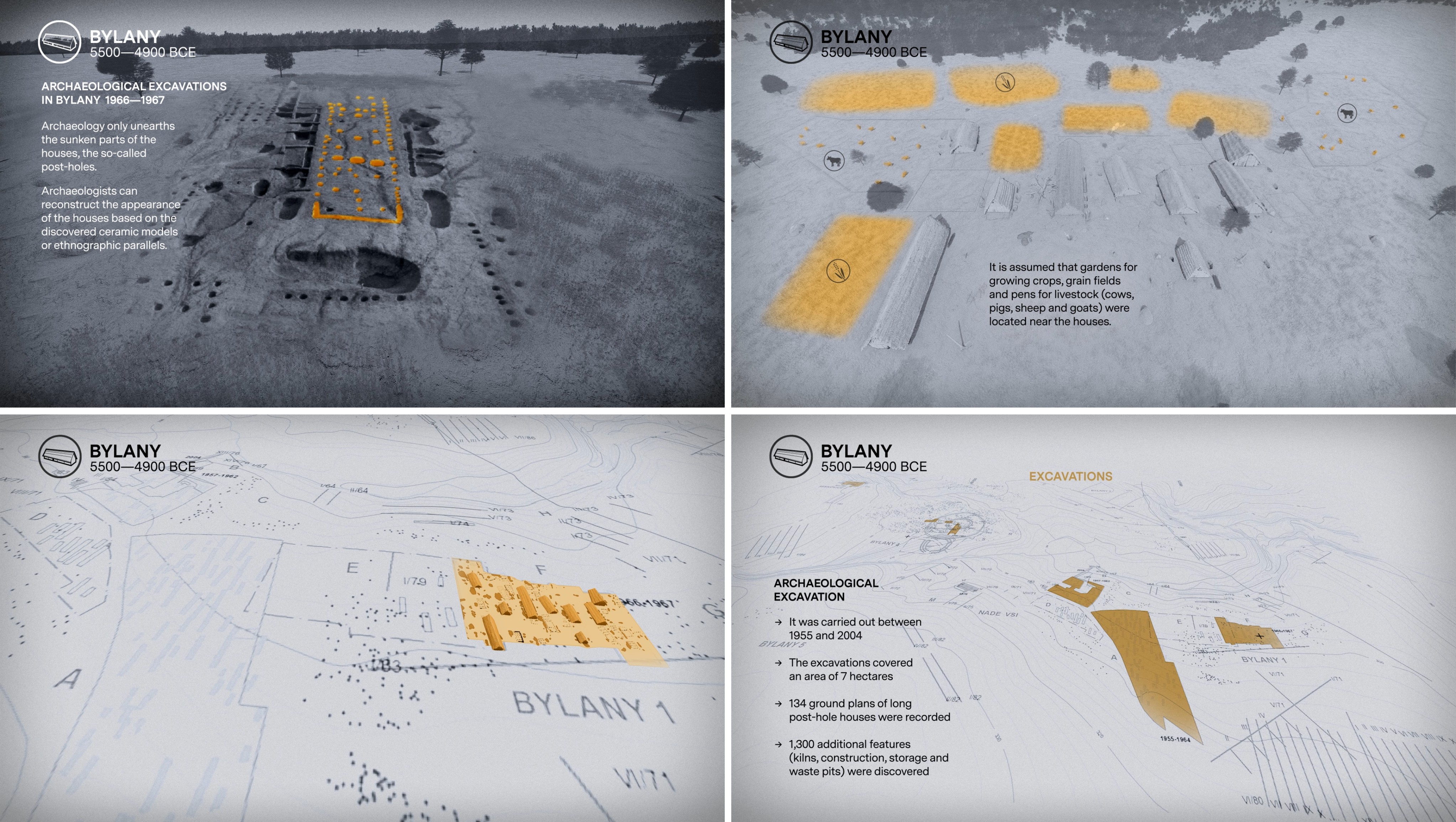
Archaeological fieldwork at the selected sites had been carried out over many years, providing highly detailed plans and documentation of both entire areas and individual features. The reconstructions of above-ground structures — houses, fortifications or ramparts — were based on widely accepted interpretations in the literature and verified through consultation with field experts and site directors.
The visual form of the models was created using a clay-rendering style in shades of grey, with slightly emphasised contours. This stylised language intentionally shifted the image from realistic depiction to abstraction, highlighting the essential features of objects and facilitating the integration of information graphics (Samara 2014, 202).
The rendering approach adopted non-photorealistic rendering (NPR) techniques (Isenberg et al. 2006), which simulate hand-drawn qualities and communicate interpretive uncertainty intuitively. NPR styles make reconstructions more legible and cognitively accessible by visually signalling their interpretative nature (Strothotte et al. 1999).
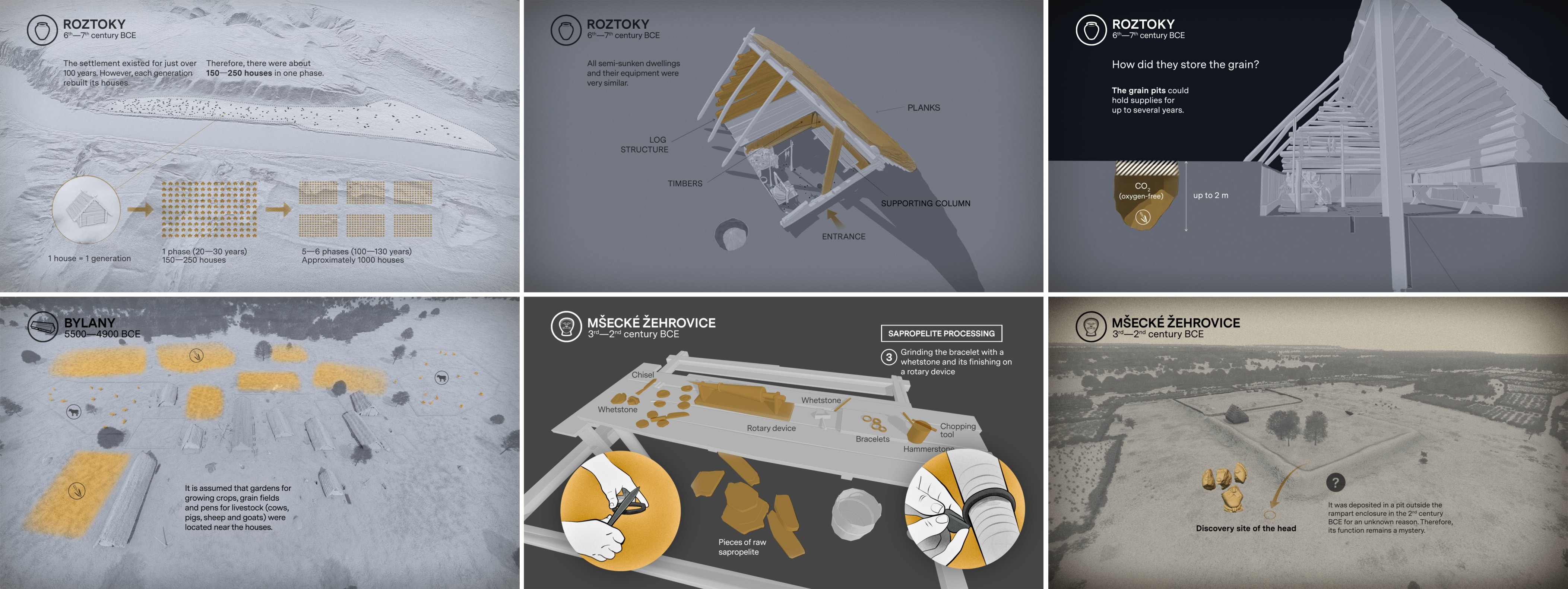
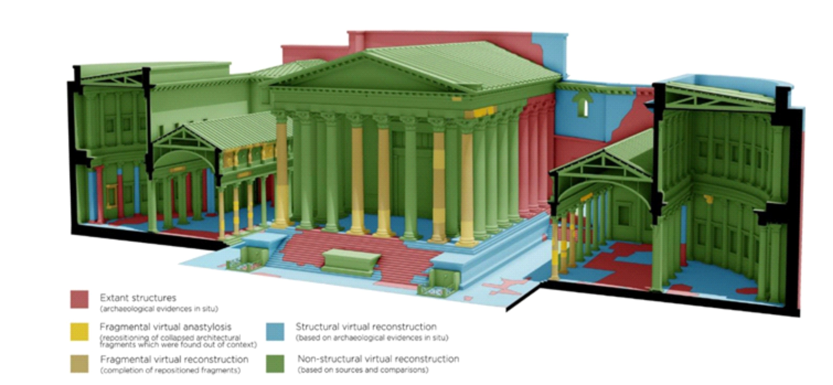
To further emphasise uncertainty, the models incorporated differential transparency. Archaeologically attested structures were shown in solid tones, while hypothetical or reconstructed features were rendered semi-transparent. Movable artefacts and human figures were visualised with even higher transparency, and vegetation was modelled using data from environmental analyses (Figure 10).
Photo-realistic rendering was used only where geometric and material data derived directly from scanning, or structure from motion (SfM) documentation, were available (Figure 11). Because this approach implies a high degree of certainty and is computationally demanding, it was applied exclusively to real artefacts or contexts and avoided for hypothetical reconstructions, to prevent misleading impressions of accuracy (Roussou and Drettakis 2003).
3D scanning and light detection and ranging (LIDAR) data were used to generate terrain models and selected artefacts. Publicly available DMR 5g data from the Czech Geodetic and Cadastral Office were processed and cleaned to remove modern intrusions. Additional scans of period artefacts and structural elements, obtained via SfM, enhanced precision and transparency in the final compositions (Figure 12).
Finally, dynamic animation was employed as a communicative tool for visualising change and uncertainty (Pang et al. 1997). Simple schematic animations, using reduced geometric detail, allowed uncertain or interpretive features to be displayed clearly while maintaining focus and legibility (Frischer and Stinson 2007; Strothotte and Schlechtweg 2002). Such stylised animation proved particularly effective for engaging audiences without overstating scientific certainty (Figure 13).
This workflow merges stylisation, NPR and transparency techniques to communicate both the certainty and ambiguity of archaeological interpretation (see Table 1). By clearly differentiating levels of reliability, the visualisations remain scientifically credible while accessible to non-specialist audiences, in accordance with the principles of the London Charter.
| Stage | Purpose | Techniques / Visual Style | Representation of Uncertainty |
|---|---|---|---|
| Model Design | Transform archaeological documentation into digital form | CAD modelling, GIS integration, consultation with experts | Based on verified plans; interpretive gaps acknowledged |
| Clay Rendering | Establish a neutral and coherent visual language | Monochrome grey shading, emphasised contours (Samara 2014) | Stylisation signals that the image represents interpretation, not imitation |
| Non-Photorealistic Rendering (NPR) | Communicate interpretive nature intuitively | Hand-drawn aesthetic, simplified textures and contours (Isenberg et al. 2006) | Stylised appearance intuitively conveys subjectivity |
| Transparency Mapping | Differentiate levels of data reliability | Layered transparency for structures, artefacts and vegetation | Solid = attested; semi-transparent = hypothetical; high transparency = symbolic |
| Photorealistic Rendering | Visualise fully verified artefacts or scanned contexts | Structure-from-motion (SfM), laser scanning, realistic shaders | Used only where geometry and materials are known |
| 3D Scanning and Terrain Modelling | Integrate authentic spatial data | LIDAR DMR 5g data, SfM models, manual cleaning | Guarantees spatial accuracy and verifiable provenance of the data |
| Dynamic Animation | Depict change and guide interpretation | Schematic key-frame animation, reduced geometric detail | Animation clarifies uncertain parts and demonstrates hypothetical reconstructions |
The creation of visual content in 3D reconstruction is both a technical and artistic process. Choices of projection, perspective and composition determine not only the clarity of information but also the emotional impact of the scene. These elements shape how the viewer perceives scale, depth and atmosphere, and thus play a decisive role in archaeological storytelling (see Table 2).
| Visual Element | Purpose | Techniques / Visual Style | Effect on Viewer / Interpretation |
|---|---|---|---|
| Perspective Projection | Represent space and depth in a natural, human-like way | Single- or two-point perspective; moderate FOV; pedestrian horizon | Enhances realism, emotional engagement, and sense of presence |
| Axonometric / Orthographic View | Provide analytical representation of spatial relationships | Parallel projection, orthographic camera, neutral background | Maintains geometric accuracy; reduces distortion; supports analytical interpretation |
| Horizon Placement | Define viewer position and emotional relationship to the scene | Pedestrian horizon (eye height), bird's-eye or elevated view | Pedestrian = immersive and empathetic; Bird's-eye = detached overview and spatial dominance |
| Field of View (FOV) | Control perceived spatial scale and intensity of immersion | Wide FOV (70–120°) for openness; narrow FOV (<50°) for descriptive, near-orthographic effect | Wide = immersive and dynamic; Narrow = analytical and focused (Figure 17) |
| Perspective Section | Combine structural clarity with spatial depth | Perspective cut through terrain or architecture; simplified hatching | Explains complex contexts effectively; connects technical accuracy with atmosphere |
| Stand-ins (figures, animals, vegetation) | Provide scale reference and emotional anchor | Silhouettes or stylised characters placed near horizon | Reinforce empathy, spatial comprehension, and narrative connection (Figure 19) |
Most scenes were rendered using perspective projection, which most closely reflects natural human vision (Figure 14). Depending on the interpretative goal, perspective types ranged from one-point views for focused scenes to two-point perspectives for contextual overviews. Three-point perspectives were avoided because of their distortion of vertical lines (Figure 15).
Horizon placement strongly influences perception: a pedestrian horizon (eye height of a standing adult) creates immersion and empathy, while a bird's-eye view distances the viewer and is better suited for spatial overviews (Figure 16). For structural clarity, axonometric and orthographic projections were also used, enabling undistorted measurements and comparison of spatial relationships (Meechao 2018).
The field of view (FOV) acts as the visual gateway through which the audience enters the reconstructed world. A broad FOV widens perception and invites exploration, while a restricted one directs attention to specific details and fosters analytical observation (Figure 17). Controlling FOV helps modulate the emotional intensity of the scene and the degree to which the viewer feels physically 'present' in the visualised space.
Perspective sections combine the logic of architectural drawings with spatial atmosphere, effectively explaining the depth and layering of archaeological contexts. Axonometric projections, free of distortion, are particularly valuable for complex sites or features requiring accurate proportional relationships (Figure 18).
Including silhouettes of people, animals or trees — the so-called stand-ins — provides scale and emotional resonance (Figure 19). When placed near the pedestrian horizon and rendered in stylised form, they enhance immersion and allow viewers to identify with the depicted scene.
The effectiveness of visual communication depends on the composition and structure of the image. The clarity of a message arises from how forms and spaces are arranged into a coherent whole. A weak or ambiguous composition leads to confusion, while a deliberate and balanced one enables clear interpretation and emotional engagement (Samara 2014, 36).
A coherent composition establishes hierarchy and focus, guiding the viewer naturally through the scene. Even when contrasting elements are used, their internal consistency ensures continuity and meaning. A well-designed composition thus combines precision with atmosphere, allowing the author to embed meaning intentionally (Samara 2014, 72–73) (Figure 20).
The use of blank space is one of the most effective compositional tools. Simplifying the image and removing redundant detail highlights what is essential and strengthens rhythm and focus (Figure 21).
Text functions as both information and design. Short labels or questions can orient the viewer and clarify the message, but in animation text should appear separately from movement to avoid distraction.
Pictograms convey information quickly and clearly through simplified symbols, enhancing readability and reducing the need for long textual explanations (Figure 22).
Selective use of colour acts as a spotlight that directs attention to key artefacts or contexts and enhances memorability (Olsson and Sundahl 2020; Wu and Yuan 2003). Within otherwise neutral scenes, colour supports both clarity and narrative emphasis (Figure 23).
Diagrams simplify complex information into intelligible visual forms. Each should convey one clear message, combining conceptual precision with visual economy (Do and Gross 2001; Figure 24).
Finally, scales, dimensions and timelines orient the viewer in space and time, clarifying proportions, relationships and chronological sequence (Figure 25).
In summary, effective composition transforms technical reconstructions into coherent visual narratives. Through structure, hierarchy and selective emphasis, archaeological visualisations become both intelligible and emotionally engaging (see Table 3).
| Element | Purpose | Visual Function | Effect on Viewer / Interpretation |
|---|---|---|---|
| Composition | Structure the visual message and establish hierarchy | Organises forms and spatial relationships into a coherent whole | Clarifies focus, builds continuity, and supports emotional engagement |
| Blank Space | Emphasise essential elements by simplifying the image | Removes redundant details and strengthens visual rhythm | Directs attention and reduces distraction |
| Text | Support interpretation and orientation | Short labels or questions clarify meaning and guide perception | Improves comprehension and directs focus |
| Pictograms | Communicate information quickly and clearly | Use simplified symbols instead of longer text | Enhances readability and universality |
| Colour | Highlight key artefacts or contexts | Adds selective contrast in otherwise neutral visuals | Focuses attention and improves memorability |
| Diagrams | Simplify complex information | Use minimal 2D/3D graphics with clear message | Increases clarity and cognitive accessibility |
| Scales, Dimensions, Timelines | Provide spatial and temporal orientation | Define proportions, direction, or chronology | Helps understand relationships and context |
Early in the debate about the principles of representing uncertainty in scientific data, methods were proposed that included overlaying and comparing data (e.g. graph embedding), using pictograms, modifying visual attributes of data, improving psychovisual metaphors (e.g. highlighting certain parts), making more explicit use of explanatory labels, interacting with statistical data, and using information graphics methods applied to 3D visualisations of scientific data (Johnson and Sanderson 2003, 5).
For expert visualisations, additional information can be used to show what data the displayed output of the 3D computer reconstruction is actually based on, thus showing the resulting confidence in the reconstruction relatively simply. Scientific visualisation must emphasise clarity and persuasiveness (Šindelář 1973, 110). The primary translation of scientific knowledge into visual form usually involves a range of graphical representations, from diagrams, maps and schematics, used to depict the living world (Kevles 1992). Thus, scientific visualisation uses the principles of technical illustration, which is based on accuracy, geometry and precision, as well as the principles of diagrammatic illustration, which is characterised by significant simplification of what is depicted and usually includes diagrams, charts or plans, and finally the principles of didactic illustration, which uses typification and illustration (Šindelář 1973, 91–93).
Furthermore, it is precisely the visual output of 3D reconstruction models that needs to be supplemented by this type of data, providing additional information and explanation of the overall context of the situation. It is, therefore, desirable to include plans, maps, graphs, technical drawings, scales, and other outputs, such as 3D digital documentation, etc., in the visual concept. Only then does the visualisation of the 3D reconstruction computer model take on a specific information message and its scientific mission. The combination of different types of graphical representations and, specifically for archaeology, technical drawings, with the output from the 3D reconstruction model can form a compelling message in the resulting visualisation (Figure 26).
It is evident that a comprehensive view of the past through images is composed of multiple factors that, despite their integration, can never reproduce the past in its original contours. The imagination of past reality is conditioned by two fundamental components: scientific evidence and artistic representation, whose interaction defines both credibility and engagement. This section therefore focuses not on the technical process already described but on the interpretative and communicative implications of digital reconstruction as a medium bridging science and art.
3D reconstruction — more precisely, archaeological virtual reconstruction — thus straddles the boundary between these two domains. It may be understood as an equivalent to expressing an archaeological idea in words: the form of interpretation constitutes the 'idea', while its visual manifestation shapes the 'message'. This cognitive process is crucial for understanding how scientific reconstruction methods and 3D visualisation techniques jointly articulate the so-called uncertainty embedded in archaeological data (cf. Apollonio 2016; Ferdani et al. 2020).
However, methodological approaches alone cannot convey curiosity, enthusiasm or emotional engagement. Without accessible narrative framing, even the most precise reconstruction remains opaque to non-specialists. Therefore, visual communication must operate on two levels — scientific transparency and public intelligibility — while maintaining ethical standards set out in the London Charter (Hermon et al. 2007).
If visual language is regarded as a form of communication between social groups (Kostelnick 1993, 244), the gap between professional and public perception becomes apparent. The academic viewer reads data and metadata; the general audience responds to clarity, colour and atmosphere. While complex metadata cannot be expected to be immediately understood by non-experts (cf. Apollonio 2016; Demetrescu 2015), the consistent use of visual cues such as colour and transparency can form a shared vocabulary for expressing uncertainty (cf. colour symbology). These visual strategies replace static database-like presentations with more intuitive communicative forms (Figure 27).This dual-coding approach — scientific accuracy supported by narrative design — reflects a broader paradigm shift in heritage visualisation, where clarity and credibility are not opposing but complementary goals.
The present study regards visual legibility as an elementary principle for both professional and educational outputs. While methodological reconstructions aim at scientific precision, educational videos must employ a broader palette of dynamic techniques to sustain engagement. Following the typology of Pujol-Tost (2008), this work primarily corresponds to traditional approaches and interfaces for presenting the past categories of archaeological visualisation, which together form the most frequent and accessible modes of public presentation.
The debate on data validity and uncertainty in digital reconstructions originates with Paul Reilly (1992), who proposed colour scales, transparency and metadata links to express levels of confidence. Given that the main output of the current project was a video, the latter option was not practical; instead, we adopted a combination of differential transparency and NPR rendering. This choice serves two purposes: it communicates uncertainty intuitively, even to non-experts, and it produces a visual language that remains aesthetically stable over time (Figure 28).
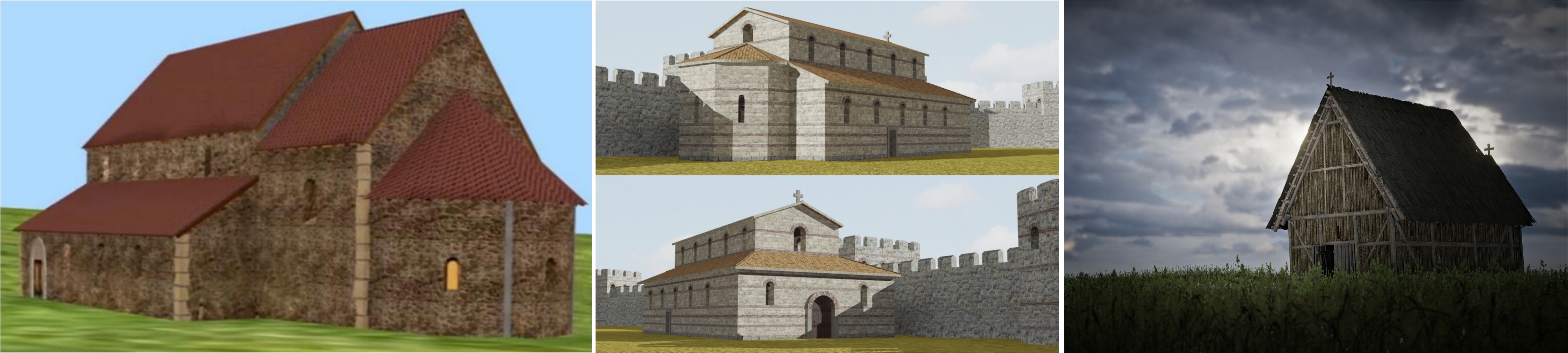
Photo-realism, in contrast, has long been debated. While attractive to the public for its apparent realism, it risks blurring the distinction between evidence and interpretation (Olivito and Taccola 2014; Wittur 2013). For this reason, its use here was intentionally limited to scanned artefacts and verified contexts, where geometry and texture derive from real data. In doing so, the project aligns with the ethical principle that realism should correspond to measurable certainty, while interpretation should remain visually signposted.
The choice of perspective projection also influences clarity. Excessively wide angles may introduce spatial distortion or visual clutter (Pretto et al. 2009). Limiting scenes to one- or two-point perspectives increases legibility and narrative focus (Kurtuluş 2011).
In summary, this study supports the notion that “virtual archaeology was not only about 'what was' and 'what is'… but also about 'what ifs' and 'what might come to be'” (Beale and Reilly 2017, chap. 2). The aim is not to reproduce an immutable past but to visualise possibilities that stimulate curiosity and interpretation. Through ambiguity and openness, virtual reconstructions encourage a deeper understanding rather than a definitive account (Miller and Richards 1995).
Although such reconstructions may appear as mere images, they can generate new insights (Lacanette et al. 2017; Moskvin et al. 2021; Poigt et al. 2021) and enrich both scholars and the public with a visual language of the past and its interpretative processes. Images remain a universal medium of knowledge transfer, and developing a standardised visual grammar for archaeological 3D reconstructions — capable of conveying meaning across cultural and disciplinary contexts — represents a crucial direction for future research.
The combination of NPR techniques, varying the transparency of structures according to their veracity, and applying a photorealistic style only to existing features, appears to be fully consistent with the principles of the London Charter. The viewer can thus intuitively and immediately understand the factual condition of the archaeological features and contexts under investigation, as well as the extent and nature of factual uncertainty in the resulting visualisation (London Charter 4.4).
Thus, a standard approach that could be applied to any reconstruction of the past is using the visual imagery techniques mentioned above, supported by elements of expert visualisation; in other words, applying principles of technical, diagrammatic and didactic visualisation as far as possible. The combination of 3D computer reconstruction visualisations with other graphic elements such as text, diagrams and pictograms significantly increases the information value of the videos and the credibility of the 3D models presented. Simultaneously, including different visualisation styles enriches the content and facilitates the viewer's orientation and understanding of the comprehensive information.
Last but not least, in addition to the approaches mentioned above, the preparation of the videos should not be underestimated, starting from the core concept through storyboards to the final visual design. Identifying the core concept and its supporting elements at an early stage allows the creation of a consistent and understandable visual story. Precise definitions of key messages and their subsequent visual implementation are crucial to successful communication with the general public.
This work was financially supported by Ministry of Culture of the Czech Republic (DKRVO 2024–2028/17.I.c, National Museum, 00023272).
Preparation of this article was supported by the large research infrastructure project Archaeological Information System of the Czech Republic (LM2023031).
Internet Archaeology is an open access journal based in the Department of Archaeology, University of York. Except where otherwise noted, content from this work may be used under the terms of the Creative Commons Attribution 3.0 (CC BY) Unported licence, which permits unrestricted use, distribution, and reproduction in any medium, provided that attribution to the author(s), the title of the work, the Internet Archaeology journal and the relevant URL/DOI are given.
Terms and Conditions | Legal Statements | Privacy Policy | Cookies Policy | Citing Internet Archaeology
Internet Archaeology content is preserved for the long term with the Archaeology Data Service (ROR). Help sustain and support open access publication by donating to our Open Access Archaeology Fund.
 Home
Home